Wednesday, October 2, 2019

Assignment #4 - I'm A Toy

Buckle up! This is gonna be a long post. I can feel it...

The final product.
 If one couldn't already tell by the title and top picture, the goal of this project was to use a number of Photoshop's tools in order to turn ourselves into toys (or robots, or cyborgs, but that's semantics at this point). The main guidelines were to make sure that our material was convincing enough and that we had a good environment to go along with; otherwise, this project provided a relative amount of freedom. As a proof of concept, we were each required to submit at least 3 different proposals for this project in the form of sketches, which I enjoyed, because sketching is totally my forte!

My three proposals were to fashion myself after a Nendoroid, a plush toy, or a bobblehead. The plush toy idea was dropped after the realization that making the texture look convincing would be far too time-consuming, and the bobblehead proposal was scrapped because both because I didn't think it would take much effort and because I wasn't actually able to guarantee that I could get someone to take part in my photo. That left the Nendoroid proposal... for those who don't know, Nendoroids are essentially deformed plastic figures with a bunch of swappable joints and faceplates. It was the perfect blend of challenge and familiarity for me.

This was my final sketch proposal! Isn't it cute?
Going into the project... I'm reminded of a quote in class, saying something along the lines of "your next project will be time-consuming, but this one will be difficult". It's a good quote, but at the time I didn't realize difficult ALSO meant time-consuming... I kept track for this project, and it took a total of around 15 hours to complete, not including the several hours I spent sketching proposals and trying to use the camera. (It always comes back to that camera, doesn't it...)

The first step was trying to change up the material from flesh and cloth to shiny smooth plastic, which was relatively painless but also extremely precise. The Smudge Tool was my best friend here, as it made smoothing out the skin a lot easier, but it was far from the only thing I used. It also took a bit of blurring and a lot of painting, especially to emphasize the highlights and shadows on certain areas.

Following that, a variety of edits were made to add extra detail, simplify facial features, and overall make myself look more like a typical Nendoroid. This included adding joints on the ankles, sleeves, and shorts of myself, painting over the hair to make it look more like a detachable wad of plastic instead of being fuzzy, and completely painting over the nose, mouth, and ears. Thankfully, despite what I initially thought, I was able to leave most of the body untouched proportion wise as it matched the Nendoroid I used as a base.

I can't tell if the regular head size makes it look more normal, or even creepier...
There was, however, one key exception to this. The last big step was to increase the size of the head drastically so it looked more in line with a Nendoroid figure, and this was tricky to figure out. I tried increasing the head size at the start of the project, but I wasn't happy with how painting over it afterwards looked, so I decided to wait it out until I was nearly done with the head to make any edits to that area.

I experimented a lot with ways to increase the head size while maintaining a decent quality, including shrinking the rest of the image instead to make the head look bigger. Ultimately, I used a technique learned in class to make a new layer out of everything visible, cropped out the head, and adjusted it accordingly. I also used the Liquify tool to adjust the eye size and make my head more circular instead of oval-shaped, and painted over many features to make it look better quality. After that, the only steps left were to add a shadow and grain filter to make my appearance in the photo more convincing!

My favorite part of this project was learning to use the Liquify tool, for completely serious and useful reasons.
Overall, even if it didn't come out exactly like how my sketch depicted, I'm still very happy with how this came out. The tools that I got to use in this project were some of my favorites so far, and even if I was admittedly pretty sour about my progress at the beginning, that attitude began to change as I got farther along. It did take up a lot of my time, though, and I'm looking forward to getting at least a few days of peace and quiet before starting my next project for this class... it's definitely going to be exciting!

Monday, September 23, 2019

Assignment #3 - Restoration

Another assignment has come and gone, which means it's time for another blog post! I always look forward to writing these, because I like to put my thoughts and feelings on projects into words that I can comprehend and look back on. I'm not entirely positive that running this blog is supposed to be the project I'm most invested into, though...

The finished restoration.
The goal for this project was restoring a worn-down photo and making it look brand new (well, as "brand new" as you can make an old, pixelated sepia-tone photo look). I didn't get to use a photo from my own family, primarily because I was surprised to learn that none of the several family members I asked had any old photos that I could use, so instead I went with one of the examples in the class folder... and, you know, I think I've honestly gotten attached to them. I have no idea who they're supposed to be, but editing them for so long has made me feel a sort of bizarre kinship towards this family. I'd like to think the second guy from the right would be cool to talk to.

The big tools for this project were the spot healing brush and the clone stamp tool. The spot healing brush was... alright? It's a genius tool in concept, but in practice it didn't help very much for the assignment. I mostly used the default "Content Aware" setting, as "Create Texture" was too harsh and "Proximity Match" was very hit-and-miss with where it drew color from. Even then, though, the spot healing brush smoothed out a lot of the grain and pixelation in the photo, which I ended up having to fix later. The Clone Stamp tool, on the other hand, was extremely useful, and I had a lot of fun pulling from different sources of the photo to recreate missing pieces of the photo. It's like the modern Frankenstein's monster... if, well, Frankenstein's monster looked more convincing and not like a freakish chimera of a man. I also got to use the Dodge and Burn tools a lot more compared to the Multiplicity assignment, and I think it really helped make the figures in the photo stand out more.

A comparison between the original, damaged photo and the final product. Big difference!
Overall, I'm pretty happy with the results of this restoration. It was a bit challenging figuring out the division between nailing for an accurate recreation and sacrificing limitations of the photo-creation process in order to create something that looks more modern, but I think I hit a happy medium between the two. Here's to hoping the next project will be just as entertaining!

Thursday, September 12, 2019

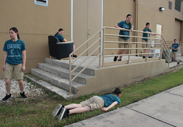
Assignment #2 - Multiplicity

A word of advice for all teachers and professors... never denote which of the assignments you'll give is supposed to be the easiest one. It'll just make the students who struggle feel a whole lot worse about the future of the course.

That's a lot of Amys... Amies? I don't know what the proper plurality is supposed to be.
The task was simple enough: use quick mask and layer masking tools to create the illusion of having multiple of the same figure in one composition. That was simple enough; in fact, it was pretty easy working with the example photos in class, and I learned a lot about how to adjust the layer masks to make them fit in better (including a lesson on what the Dodge and Burn tools are supposed to be for! I've seen them for years on GIMP and had no clue what they did).

Unfortunately, when trying to perform the same task on my own set of photos, I quickly ran into issues due to one simple mistake: being put in charge of photography. I've know for years that I'm not very good at it, and that I have incredibly shaky hands, but I was expecting the use of a tripod to be enough of a failsafe to prevent that from seriously impeding my work. Unfortunately, it somehow wasn't, and I ended up having to do a LOT of editing to fit together various different perspectives of the area into one picture.

Ultimately, it led to a final product that I'm... not too particularly enthusiastic about, but should definitely be serviceable enough. It makes me wish that I got to finish my original photoshoot, as it had the least camera issues but only 10 photos to work with... and it also makes me hope that I won't have to use a camera again for the rest of the semester, as I can't say I'm thrilled at the prospect of struggling in more assignments because of it.

For fun, I ended up making a second multiplicity photo using my scrapped first set of pictures. Way easier to put together.

Tuesday, September 3, 2019

Assignment 1 - Form Painting

The final product.
The first big assignment for this semester was learning how to use Photoshop's brush tools in order to make convincing paintings of 3-dimensional objects. I've used Photoshop sparingly in the past as part of web design courses, but that delved more into understanding tools related to graphic design, so learning about the program's more painting-oriented tools was a fresh topic. The whole process took a combined total of roughly four hours to complete.

Example of an unblended cone versus a blended sphere.
While I already understood some of the basic concepts like adjusting opacity or creating straight lines for forms, the Mixer Brush tool was completely new to me, and I'm impressed by what it can do. It took some time to get used to it... blending a palette of squares together is much easier than blending colors in a form together, but I eventually reached a point where I'm really satisfied with the end results. It's taught me a lot about putting shades and tints together on objects too, and I hope I can put this newly learned information to use in my own artistic endeavors by improving my own shading technique.

Wednesday, August 28, 2019

Introduction Post

Hello there! My name is Dylan, and I'm a freshman intending to major in New Media. For a good chunk of my life, my aspiration has been to get into the video game industry, but taking dual enrollment classes over the past 2 years has made me realize that coding isn't my forte and that I'm more of a visually artistic person. As such, I'm hoping that this major will allow me to broaden my interests and try out new mediums such as animation, modeling, or even music.

Outside of my school life, I'm also an aspiring artist. I've been drawing with pencil and paper ever since I was a toddler, and got into digital art about 7 years ago; I somehow persevered using GIMP as my primary illustration program of choice up until late last year, when I switched to FireAlpaca. My main focuses are either video game fan art (I'm a huge Nintendo fan) or creating an original cast of characters as I really enjoy character design and development.

Walking into the Digital Media course for the first time, I had high hopes for the course. My best friend and fellow artistic colleague spoke highly about the class and instructor. I'm glad to say those hopes were met;  the material being covered sounds interesting and the professor's sense of humor resonated with me. I've worked with Photoshop a bit in high school for some graphic work related to web design, but otherwise these programs are completely new to me. I'm excited to learn more about how to use these programs and look forward to attending the course regularly this semester.